Here is an example of a choropleth map, which color codes data.
 |
| Choropleth Map of Thailand's Population |
An isarithmic map uses lines to project more fluid data, like this map of the globe's varying climate temperature.
 |
| Isarithmic Map of Global Climate Temp. Each Month |
A proportional symbol map depicts data with sized images instead of color to illustrate varying data, such as this map, which uses coin symbols to show the number of establishments for coin-operated amusement devices in the United States.
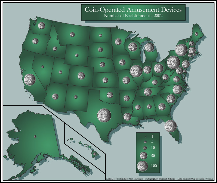 |
| Proportional Symbol Map of Coin-Operated Amusement Devices, 2002 |
Dot density maps depict data much like proportional symbol maps, but use varying numbers of dots instead of differently sized symbols to show varying data. Below is a dot density map of Georgia's population. The red dots indicate that area's population per square mile.
 |
| Dot Density Map of Georgia, US |
No comments:
Post a Comment